Client
Justice Data and Design Lab
Team
Aida (Developer)
Chelsea (UX Reseacher)
K (Project Manager)
Liuyi (Developer)
Shuying (UX Designer)
Duration
01/2024-04/2024
Responsibilities
User research
Wireframing Prototyping
Illustration
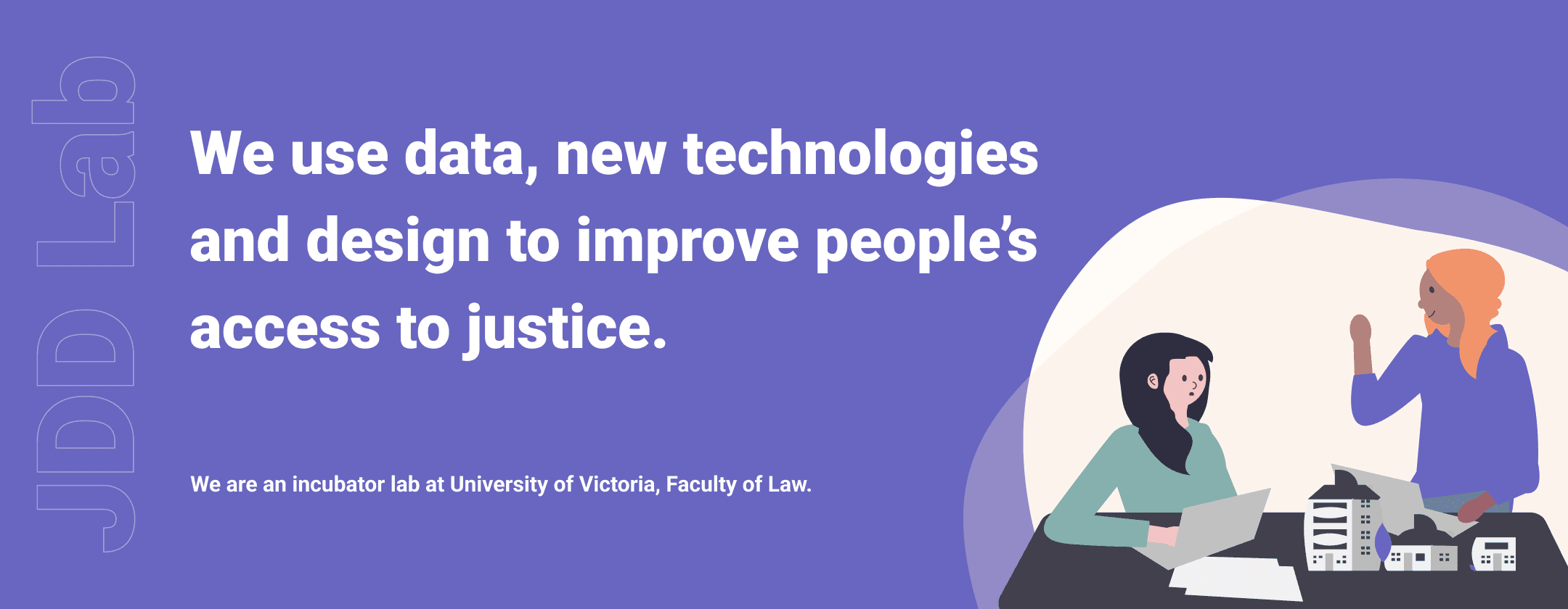
About the Client and Project
Justice Data and Design Lab from University of Victoria approached the team for redesigning a website to showcase their professional representation for better user engagement. To support this mission, the redesigned website will serve as an intuitive platform that clearly showcases the lab’s work, engages users, and facilitates collaboration.professional representation. I took on the role of UX designer to redesign their website experience.
01
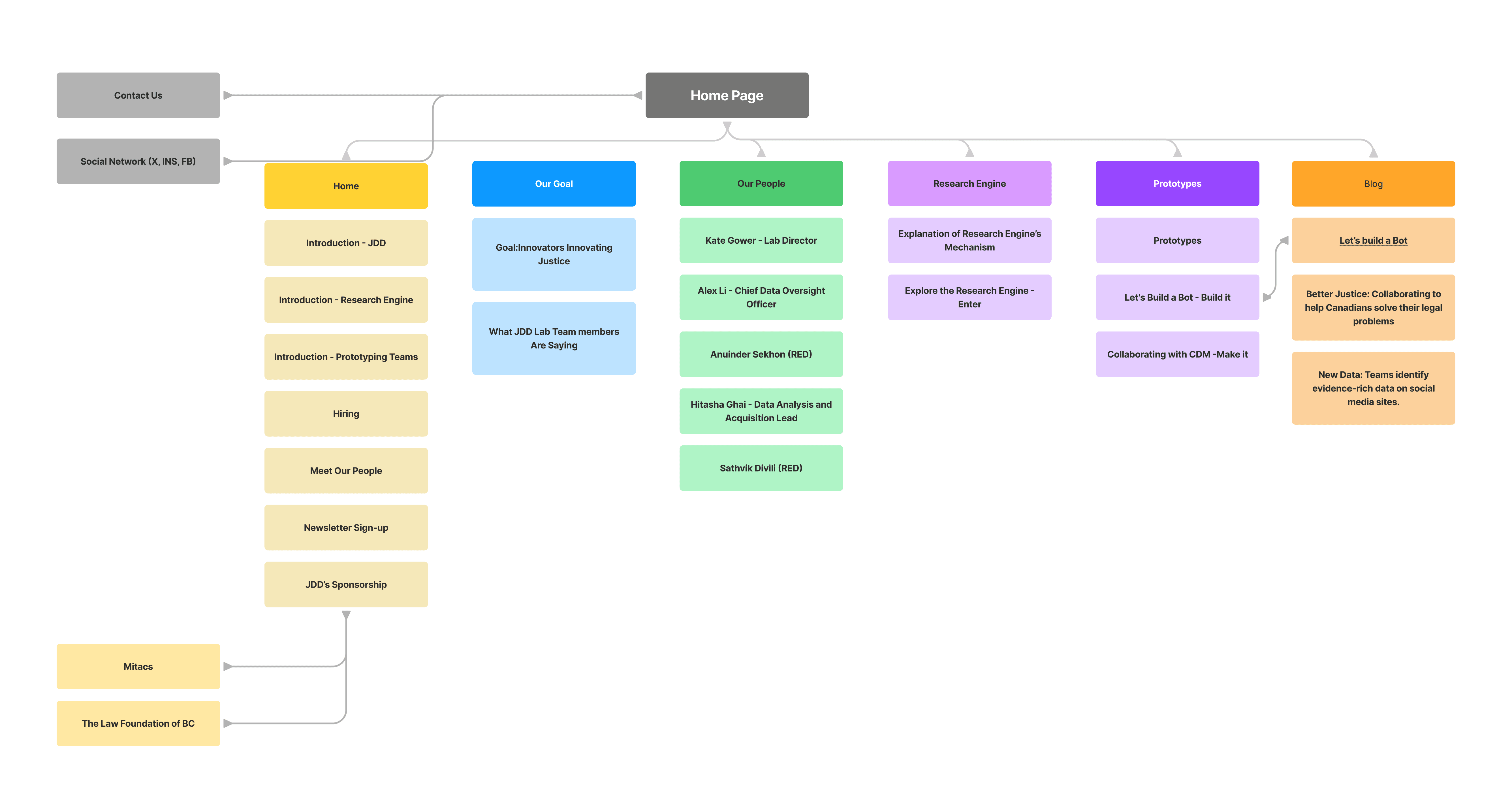
Sitemap Revision
Upon examining JDD Lab's website, I devised a site map to gain a comprehensive understanding of its content. I noticed a number of problems that didn't make sense in terms of how contents are distributed on the website. Hence, I chose to modify the site map to improve the arrangement of the content.
02
Visual Design Directions
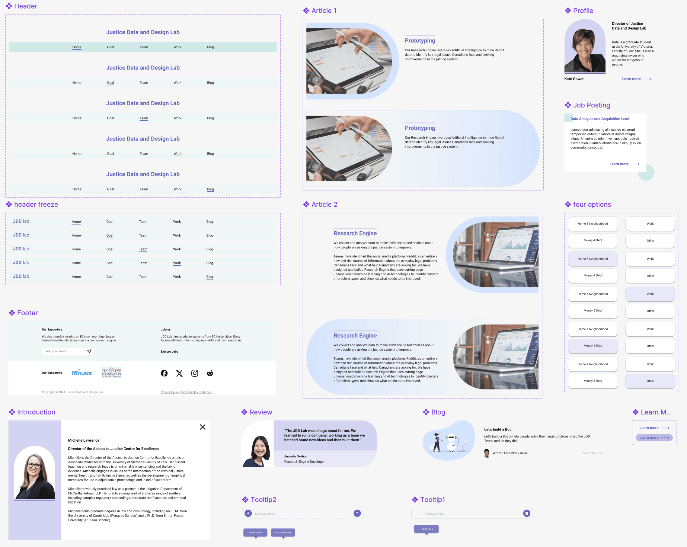
This visual design direction intends to create an approachably professional vibe, and the client chose Option 1 for visual direction which conveyed an informative, trustworthy and approachable feeling.
03
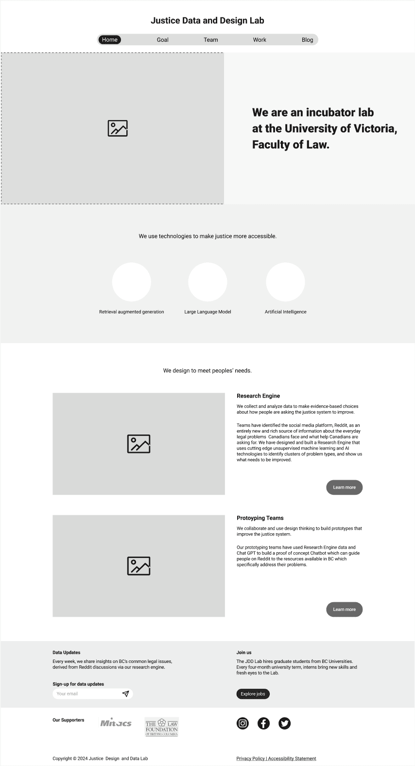
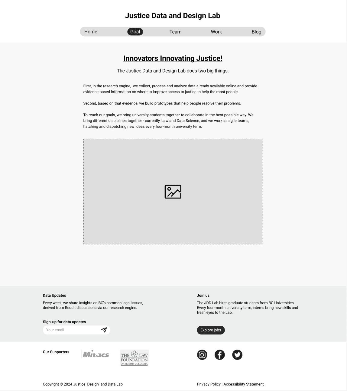
Wireframe
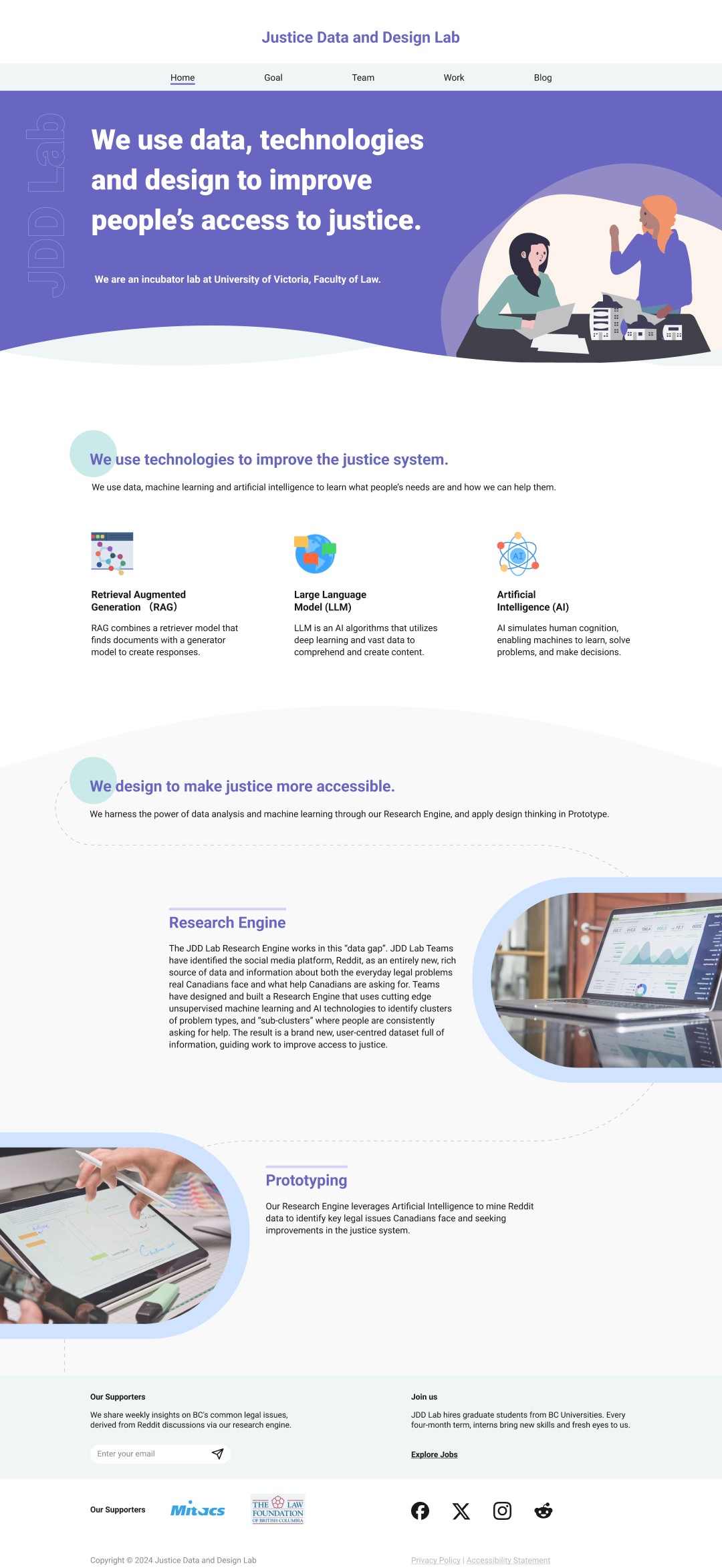
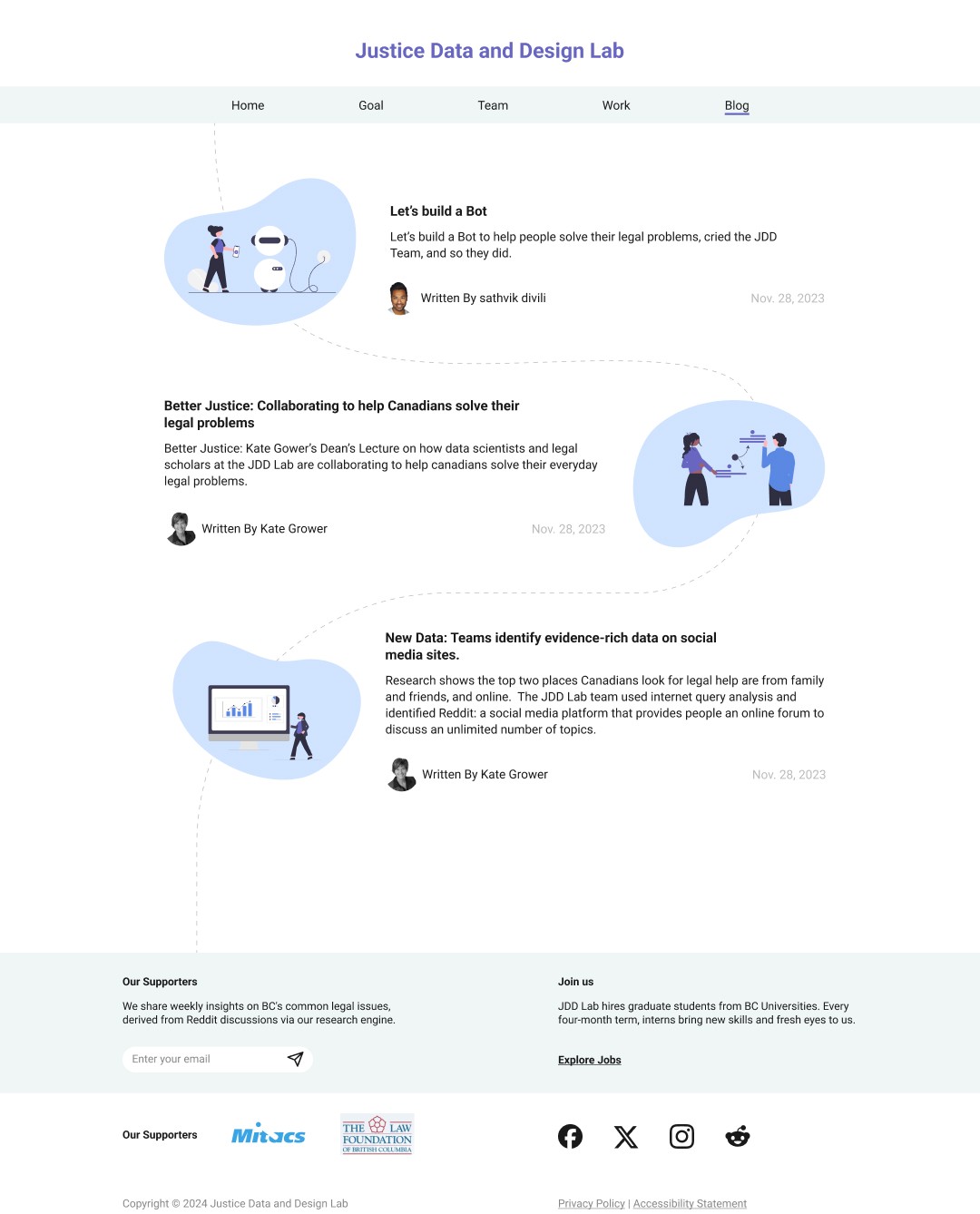
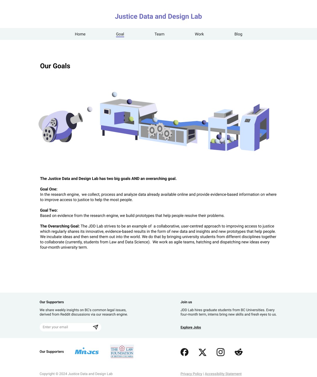
Wireframes of Home, Goal, Team, Work and Blog were created based on information architecture to showcase how the information will be presented on each webpage.
04
Style Guide
Click here to see the style as documentation.
Color Palette
Typography
Aa
Roboto is used for its readabilityand its roundness that kept consistency with the curves in the whole visual design.
Components
05
Problems solved by Re-design

Before
Before
After
Redesigned profiles to create consistency among different teams.
New design splitted people into disparate groups to clearly address each member's role.
By removing the background and using color blocks as the background to keep the consistency among the team without retaking new profile photo.

Redesigned profiles to create consistency among different teams.
Leadership team has very long introduction that could result in a lot of scrolling when viewing the website. However, the and I decided to create a pop up window
By removing the background and using color blocks as the background to keep the consistency among the team without retaking new profile photo.


Before
Before
After
Before
Before
After
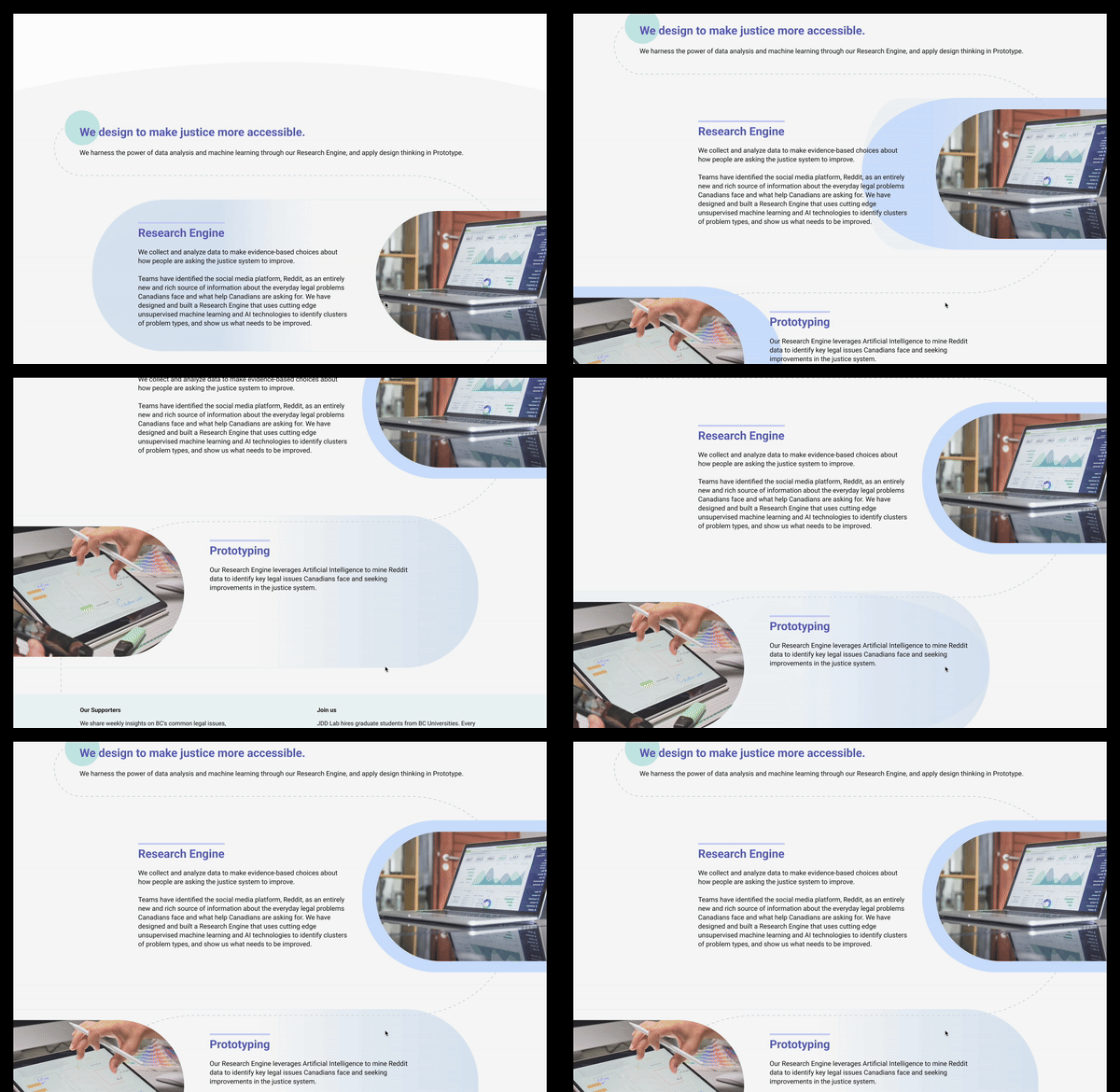
Motion and enlarged trigger area to boost clicks
Action button is changed to larger trigger area to increase
Hover motion is applied to attract users' attention and easier to access the content.
06
