

My Role
UX researcher, UI/UX designer
Duration
2 months
Responsibilities
User research, wireframing, prototyping,
usability test
Project Overview
Google Maps' primary concentration on the fastest routes can occasionally fall short, as users may seek a more exciting walking experience enriched with picturesque landscapes, quaint shops, and lush green areas. This project aim to create an embedded feature in Google Maps, boosts the experience of users by tailoring walkways according to their preferences.
IDEATION


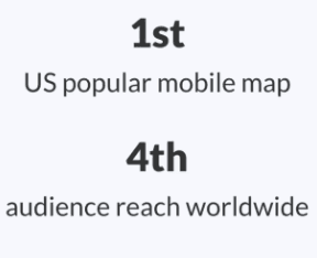


How people are enjoying walking?
The trend of citywalk is re-ocurring (via Google Trends).
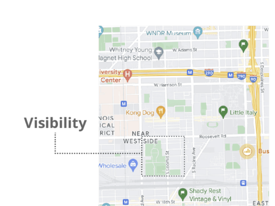
Larger cities tend to have higher walkability.
An increasing amount of Google Maps users want to WALK MORE. [1]


2024
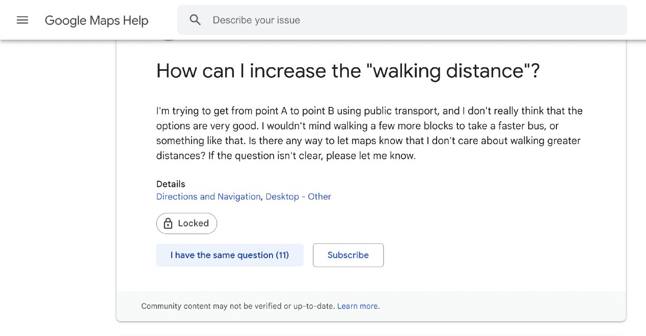


2022
What are behind the behavior of strolling?
Walkable experience seeking is often a side goal to a main goal.


i.e.explore a new commuteroute.
Visualizing experience(e.g. parks as green color blocks) is promising to users.

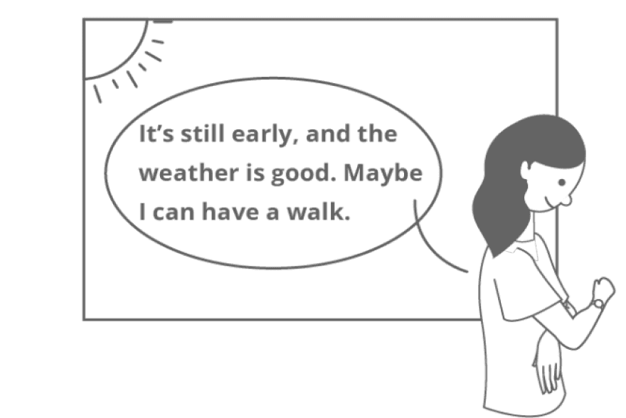
Pre-requisits for seeking better walking experience (timing/weather/mood)

Good walking experience = high walkability +efficiency.
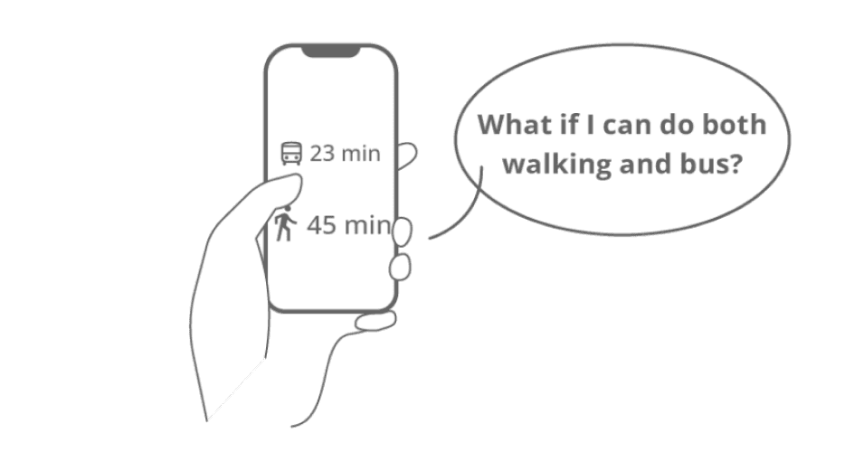

Unknown Destination
Explore / See what's around in a
new place.
Half-known Destination
A certain kind of destination (e.g. restaurants nearby) or a general area.
Known Destination
Directly search the routes and check the direction of destination
There are 3 main scenarios (potential use cases)
Here’s the Gap
There is a need for an innovative feature that aligns with urban dwellers' increasingly seek of greater walking experience.
DEVELOPMENT
Challenges
How to let users to filter out the routes?
How to visualize/preview the experience?
How to weight out the hierarchy among other existing features?
How to decide the preference which could be
highly subjective?
Ideas and potential features
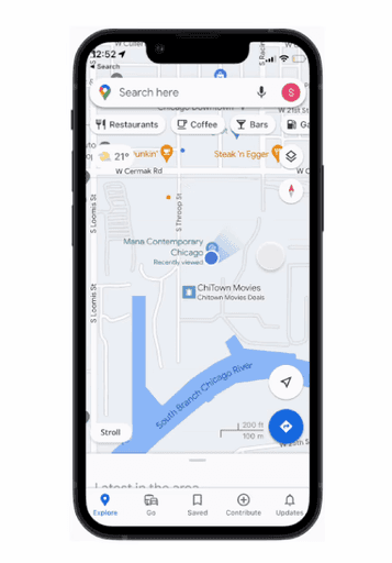
Users can access route planner feature scrolling down on Explore page.


Routes with different features color coded differently.
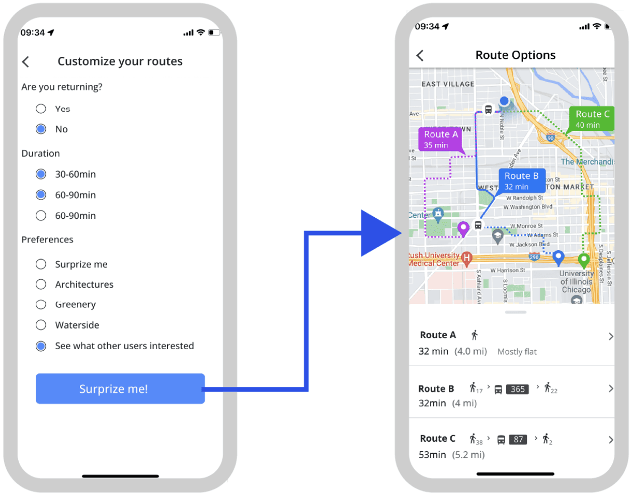

"Returning route" feature based on the use case when user want to go back.
Scenario 1
You just arrived at your hotel, and you are planning to take a walk around.
Scenario 2
You are planning to go to with a different route for commute.
Test
Feature UI: presentation of different routes, color choices
UX writing, are the copies working good?
How to access the feature? On the Explore page or direct search?
Which task/preferences should be prioritized during the user experience?
Is short survey a good way to put the preferences?
User Testing
Insights and Iterations
Userflow



My Role
UX researcher, UI/UX designer
Duration
2 months
Responsibilities
User research, wireframing, prototyping, usability test
Project Overview
Google Maps' primary concentration on the fastest routes can occasionally fall short, as users may seek a more exciting walking experience enriched with picturesque landscapes, quaint shops, and lush green areas. This project aim to create an embedded feature in Google Maps, boosts the experience of users by tailoring walkways according to their preferences.


How people are enjoying walking?
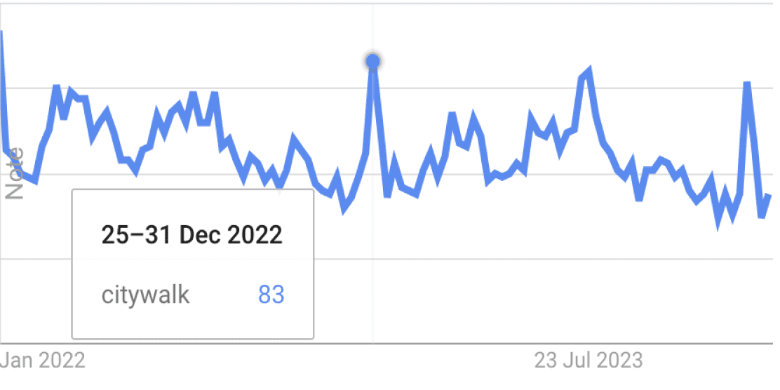

The trend of citywalk is re-ocurring (via Google Trends).
Walkability is NOT a metrics for Google Maps’ current route planning service.
Larger cities tend to have higher walkability.
An increasing amount of Google Maps users want to WALK MORE. [1]


2022
2024
What are behind the behavior of strolling?


i.e.explore a new commuteroute.
Walkable experience seeking is often a side goal to a main goal.


Visualizing experience(e.g. parks as green color blocks) is promising to users.


Pre-requisits for seeking better walking experience(timing/weather/mood)


Good walking experience = high walkability +efficiency.
There are 3 main scenarios (potential use cases)
Unknown Destination
Explore / See what's around in a new place.
Half-known Destination
A certain kind of destination (e.g. restaurants nearby) or a general area.
Known Destination
Directly search the routes and check the direction of destination
Here’s the Gap
There is a need for an innovative feature that aligns with urban dwellers' increasingly seek of greater walking experience.
DEVELOPMENT
Challenges
How to let users to filter out the routes?
How to visualize/preview the experience?
How to weight out the hierarchy among other existing features?
How to decide the preference which could be highly subjective?
Ideas and potential features


Users can access route planner feature scrolling down on Explore page.


"Returning route" feature based on the use case when user want to go back.


Routes with different features color coded differently.
Userflow


Scenario 1
You just arrived at your hotel, and you are planning to take a walk around.
Scenario 2
You are planning to go to with a different route for commute.
Test
Feature UI: presentation of different routes, color choices
UX writing, are the copies working good?
How to access the feature? On the Explore page or direct search?
Which task/preferences should be prioritized during the user experience?
Is short survey a good way to put the preferences?
User Testing
Insights and Iterations
Users prefer the feature to be more easy to find rather than has to scroll on the Explore page.
UI-wise, they found the color coding overwhelming, and also the UX writing is a bit confusing.
Action button located at the lower left corner of home page, easy to access, no need to scroll.
Modified the UX writing and color to align with the app to make it blend with the existing information hierarchy.


Users mentioned the duration option is limited.
Users tend to click on “Go!” button after picking duration rather than choose preferences.
Duration option was changed to dragging to chose the duration, and options are removed.
“Returning” option killed for user can simply use the feature again when return.


FINAL DELIVERABLES
Know Destination vs. Unknown Destination
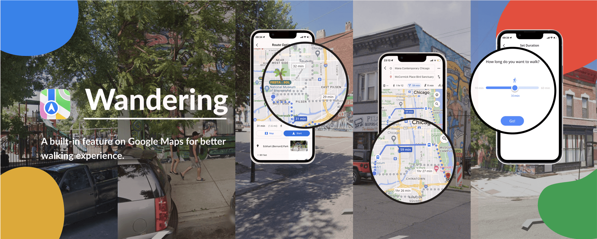
Considering the two main use cases: known destination, the feature can be accessed on the Explore page as well as through the search bar.
Access 1:
Explore page, when users are not sure about where to go
Access 2: Explore page, when users know where to go
Preview of activities and sceneries are available for user to have a better idea what they are going to come cross along the way.


Activities going on on the planned routes.
Preview of the scenery spots on the routes.


Set Duration
Preview
Routes
Go
Open
App
Browse
Routes
Home (Stroll)
Search Destination
Known Destination or Not
YES
NO
Here’s the Gap
There is a need for an innovative feature that aligns with urban dwellers' increasingly seek of greater walking experience.

Users prefer the feature to be more easy to find rather than has to scroll on the Explore page.
UI-wise, they found the color coding overwhelming, and also the UX writing is a bit confusing.


Before
Before
Changes made
Action button located at the lower left corner of home page, easy to access, no need to scroll.
Modified the UX writing and color to align with the app to make it blend with the existing information hierarchy.
After
After


Users mentioned the duration option is limited.
Users tend to click on “Go!” button after picking duration rather than choose preferences.
Users mentioned the duration option is limited.
Users tend to click on “Go!” button after picking duration rather than choose preferences.
Before


Changes made
Duration option was changed to dragging to chose the duration, and options are removed.
“Returning” option killed for user can simply use the feature again when return.


FINAL DELIEVERABLES
Know Destination vs. Unknown Destination
Considering the two main use cases: known destination, the feature can be accessed on the Explore page as well as through the
search bar.
Know Destination vs. Unknown Destination
Considering the two main use cases: known destination, the feature can be accessed on the Explore page as well as through the
search bar.
Access 1:
Explore page, when users are not sure about where to go


Access 2: Explore page, when users know where to go

Preview of activities and sceneries are available for user to have a better idea what they are going to come cross along the way.
Preview of activities and sceneries are available for user to have a better idea what they are going to come cross along the way.
Activities going on on the planned routes.


Preview of the scenery spots on the routes.
Preview of the scenery spots on the routes.


Unknown Destination
Explore / See what's around in a new place.
Half-known Destination
A certain kind of destination (e.g. restaurants nearby) or a general area.
Known Destination
Directly search the routes and check the direction of destination
UX researcher/designer
UI designer
My Role
04/2023-06/2023
Duration
User research, wireframing, prototyping, usability test
Responsibilities
Project Overview
Google Maps' primary concentration on the fastest routes can occasionally fall short, as users may seek a more thrilling walk enriched with picturesque landscapes, quaint shops, and lush green areas. Stroll, an embedded feature in Google Maps, boosts the experience of users by tailoring walkways according to their individual likings.
IDEATION

How people are enjoying walking?
Walkability is NOT a metrics for Google Maps’ current route planning service.
Larger cities tend to have higher walkability.
The trend of citywalk is re-ocurring (via Google Trends).
An increasing amount of Google Maps users want to WALK MORE. [1]


2024


2022
What are behind the behavior of strolling?
Pre-requisits for seeking better walking experience (timing/weather/mood)

Good walking experience = high walkability +efficiency.

Walkable experience seeking is often a side goal to a
main goal.

i.e.explore a new commuteroute.
Visualizing experience(e.g. parks as green color blocks) is promising to users.

There are 3 main scenarios (potential use cases)
DEVELOPMENT
Challenges
How to let users to filter out the routes?
How to visualize/preview the experience?
How to weight out the hierarchy among other existing features?
How to decide the preference which could be highly subjective?
Ideas and potential features
Userflow
User Testing
Scenario 1
You just arrived at your hotel, and you are planning to take a walk around.
Scenario 2
You are planning to go to with a different route for commute.
Test
UI of the feature: presentation of different routes, color for the feature
UX writing, are the copies working good?
How to access the feature? On the Explore page or direct search?
Which task/preferences should be prioritized during the user experience?
Is short survey a good way to put the preferences?
Insights and Iterations
Users prefer the feature to be more easy to find rather than has to scroll on the Explore page.
UI-wise, they found the color coding overwhelming, and also the UX writing is a bit confusing.
Action button located at the lower left corner of home page, easy to access, no need to scroll.
Modified the UX writing and color to align with the app to make it blend with the existing information hierarchy.


Users mentioned the duration option is limited.
Users tend to click on “Go!” button after picking duration rather than choose preferences.
Multiple choice of duration was changed to dragging to chose the duration, and options are removed.
“Returning” option is killed since user can simply use the feature again if they want to return.


FINAL DELIVERABLES
Know Destination vs. Unknown Destination
Considering the two main use cases: known destination, the feature can be accessed on the Explore page as well as through the search bar.
Access 1: Explore page, when users are not sure about where to go
Access 2: Explore page, when users know where to go

Preview of activities and sceneries are available for user to have a better idea what they are going to come cross along the way.
Activities going on on the planned routes.
Preview of the scenery spots on the routes.


Users can access route planner feature scrolling down on Explore page.

"Returning route" feature based on the use case when user want to go back.

Routes with different features color coded differently.