03
Ideation
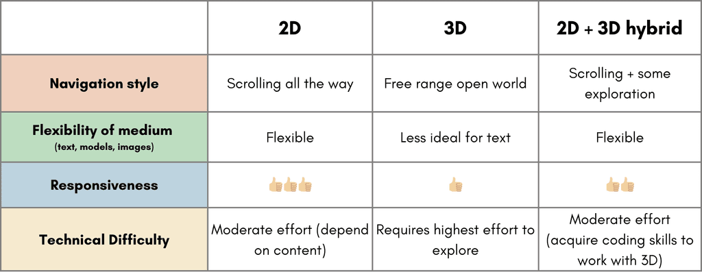
We decided to design a prototype that will be easily accessible to a wide audience and easily portable for the FNHA to showcase at various events, such as tradeshows and local community gatherings.
Virtual reality and augmented reality applications are excluded from consideration. Virtual reality requires the audience to use specific equipment to access the experience, while augmented reality depends on location-specific triggers to initiate the experience.

Virtual reality and augmented reality applications are excluded from consideration for it requires the audience to use specific equipment to access the experience, while augmented reality depends on location-specific triggers to initiate the experience.
Conclusion
Team and FNHA agreed to build a web-based prototype for its high accessibility and portability. Also, isometric images will be used to showcase 5 waypoints with “Examination Room” and "Healing Room" in details.
Web-based

Considering the use case would mainly happen at events such tradeshows and local community gatherings. Web-based product will be better for public projection.
Isometric

In between 3D and 2D, gives a sense of depth and spatial awareness that can make interactions more engaging and intuitive.
Map View + Navigation

We want to focus on the region (British Columbia) where services are offered and what is provided, rather than describing the experience.
04
Design Process
Mapping out the content
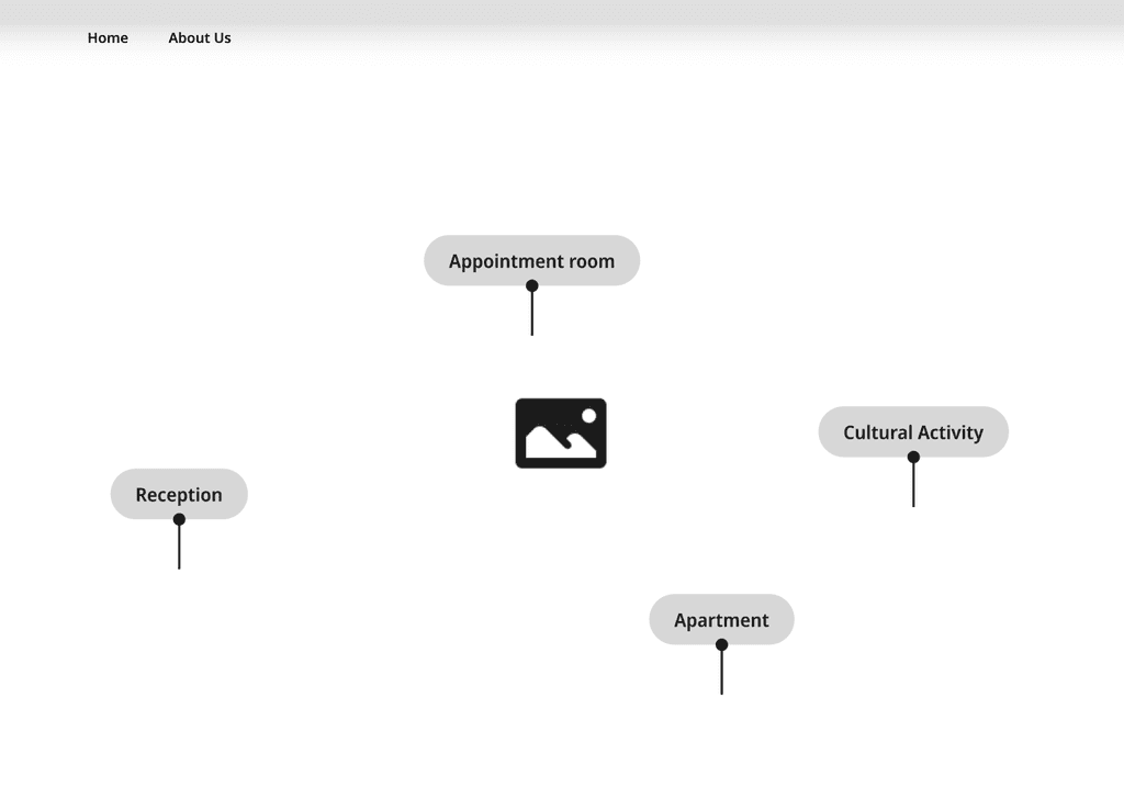
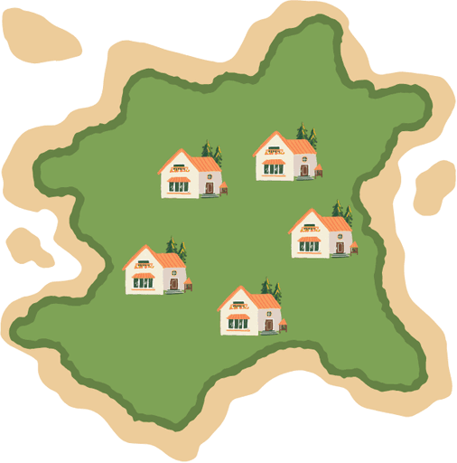
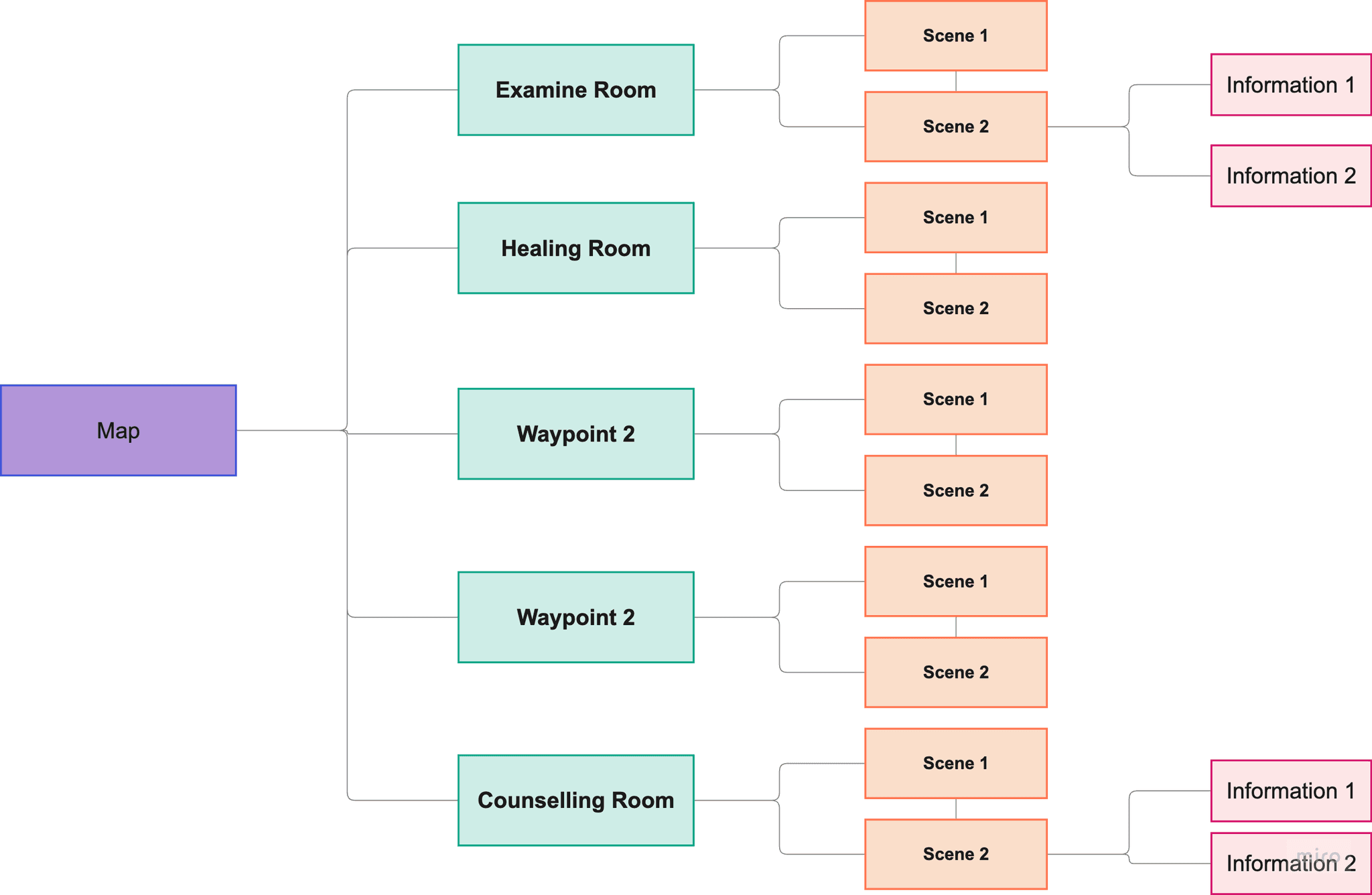
There will be 5 waypoints on the map, and each waypoint contains images that illustrates the activities that will happen within the waypoints and the function of it.
+

With a general picture of how the representation of the service, I mapped out content based on information inventory approved by the clients to decide how the product will be presented.
Wireframing the Features
To let users know that the service is provided BC wide
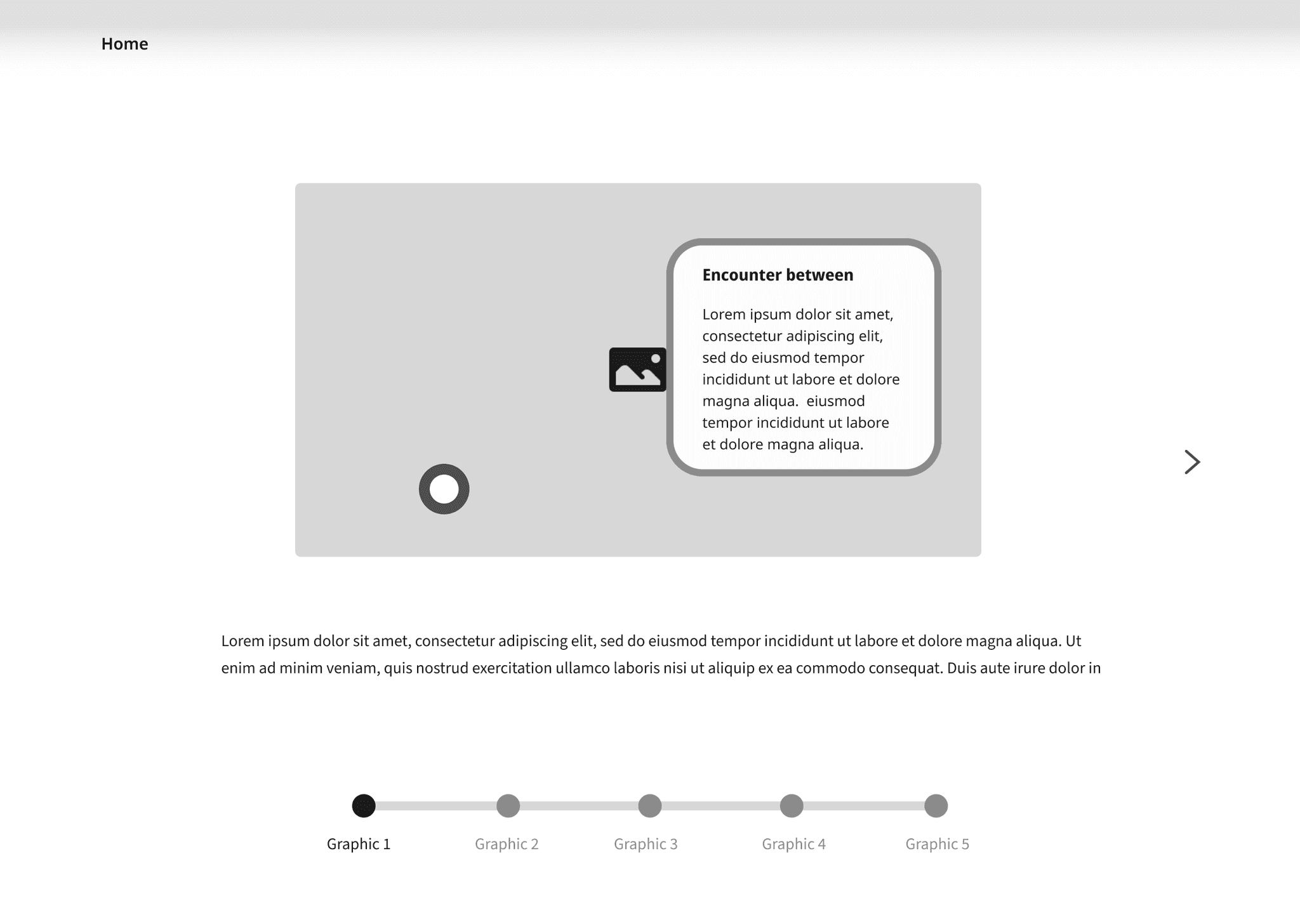
Introduction of each side panel
Visualize how many activities will happen with the waypoints
Hover to see the detail information such as what are theobjects and activities for
Prototyping

04
User Test and Iteration
We conducted user test with 10 users to investigate the product's visual and interaction, and iterated based on the user test results.
UIUX
Content
Did you find it clear to distinguish between the rooms?
From text styles A and B, which one you find the easy to read?
How effective does the room models convey the activities, rating from 1-5?
Visual
Which part of the map catches your attention the most?
How visually appealing did you find the map and rooms?

05
Final Deliverables
Check out our project trailer!!

Check out the design prototype!!
Check out the product from FNHA's website!

06
Style Guide
Typography
body
Source Sans 3
Regular
18px
/
30px
The quick brown fox jumps over the lazy dog.
heading 1
Anonymous Pro
Regular
32px
/
40px
The quick brown fox jumps over the lazy dog.
button
Anonymous Pro
Bold
24px
/
auto
The quick brown fox jumps over the lazy dog.
Spacing System
spacing 1
16 px
spacing 2
24 px
spacing 3
48 px
64 px
spacing 4
spacing 5
80 px
Color Pallet
Ocean Blue
rgba(111,188,224,1.00)
hsla(199,65,66,1.00)
#6FBCE0
FNPCI Stroke
rgba(51,153,204,1.00)
hsla(200,60,50,1.00)
#3399CC
Side panel background
rgba(238,237,223,1.00)
hsla(56,31,90,1.00)
#EEEDDF
text
rgba(30,30,30,1.00)
hsla(0,0,12,1.00)
#1E1E1E
Learn more
rgba(138,86,60,1.00)
hsla(20,39,39,1.00)
#8A563C
Components

LEARN MORE
LEARN MORE
LEARN MORE
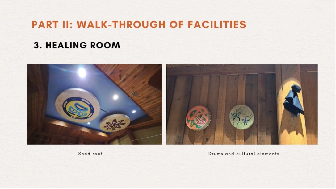
Smudging is used to create a sacred space and open the soul before calling upon spirits and their
healing powers.
Appointment Room

Lorem ipsum dolor sit amet, consectetur adipiscing elit, sed do eiusmod tempor incididunt ut labore et dolore magna aliqua. Ut enim ad minim veniam, quis nostrud exercitation ullamco laboris nisi ut aliquip ex ea commodo consequat.
LEARN MORE
About the Client and Project
The project is a collaboration between First Nations Health Authority (“FNHA”) and Cruffin, a multidisciplinary team of students from the Centre for Digital Media (CDM). FNHA, in partnership with the Ministry of Health, established the First Nations-led Primary Care Initiative (FNPCI). One of the main objectives of the FNPCI is to develop new First Nations Primary Health Care Centres (FNPCC) across British Columbia, aiming to improve access to health and wellness services for First Nations communities.
01
Identify the problem
For a promotional prototype, understanding the target audience and their needs, as well as the messages that need to be conveyed and their context, is crucial. The team used the framework of 5W1H to solicit information from FNHA, and after a few exchanges, the team collected necessary input to conclude a problem statement.
Who are the audience of the prototype?
Women aged 30-35 usually obtain information and coordinate appointment for families.
Secondary audience of the prototype will be healthcare professionals.
When: is there a time sensitivity in producing the prototype?
FNHA will have a major campaign this fall, so it will be the best we can get it ready before September
What messages do FNHA and FNPCCs want to convey? And what's their prioritization?
Team-based approach
Process of integrating wellness advice from Traditional Elders and western medicine and treatments
Cultural activities that are regularly held at the FNPCCs
Why is there a need for the project to promote FNPCCs?
First Nations people may need to travel to FNPCCs, and familiarizing themselves with the facilities will build trust.
FNHA want to send the message that First Nation people will receive culturally safe primary care at FNPCCs.
Where the prototype be shown to the target audience?
FNHA does not have a specific occasion to show the prototype. It can be trade shows, community gatherings or being hosted by FNHA.
How do the audience know about the FNPCCs?
FNHA’s website has a page introducing the First Nations-led Primary Care Initiative. FNPCCs also have individual websites and social media accounts.
So… How Might We
present and promote the FNHA Primary Care Centres so that the First Nations feel safe and respected to interact with the service?
02
Research and Findings
Comprehensive research including desktop and on-site research are conducted to understand what we are promoting and empathise with our target users.

Cultural Sensitivity
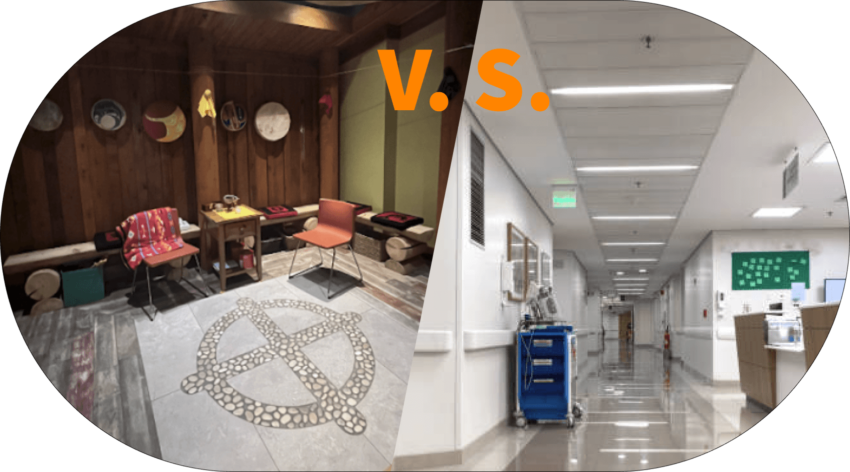
Indigenous hospitals integrate Indigenous beliefs and healing practices; normal hospitals follow Western medical models

Holistic Approach
Indigenous hospitals focus on physical, emotional, mental, and spiritual health; normal hospitals prioritize clinical care.

Community Involvement
Indigenous hospitals involve local communities in healthcare delivery; normal hospitals have limited community engagement.
Patient Experience
Indigenous hospitals create culturally safe environments; normal hospitals are more generic in design.
As research progressed, we realized lack of First Nations backgrounds made it hard for us to represent Indigenous culture… 🤯
However, onsite research
at Lu'ma Medical Centre paved our way!
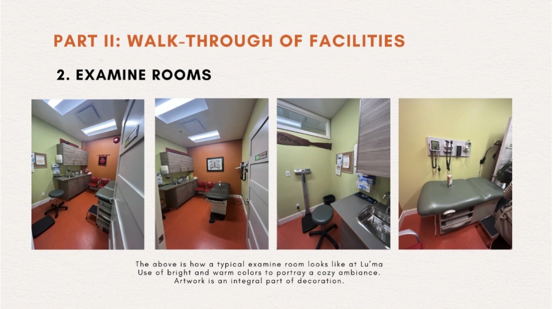
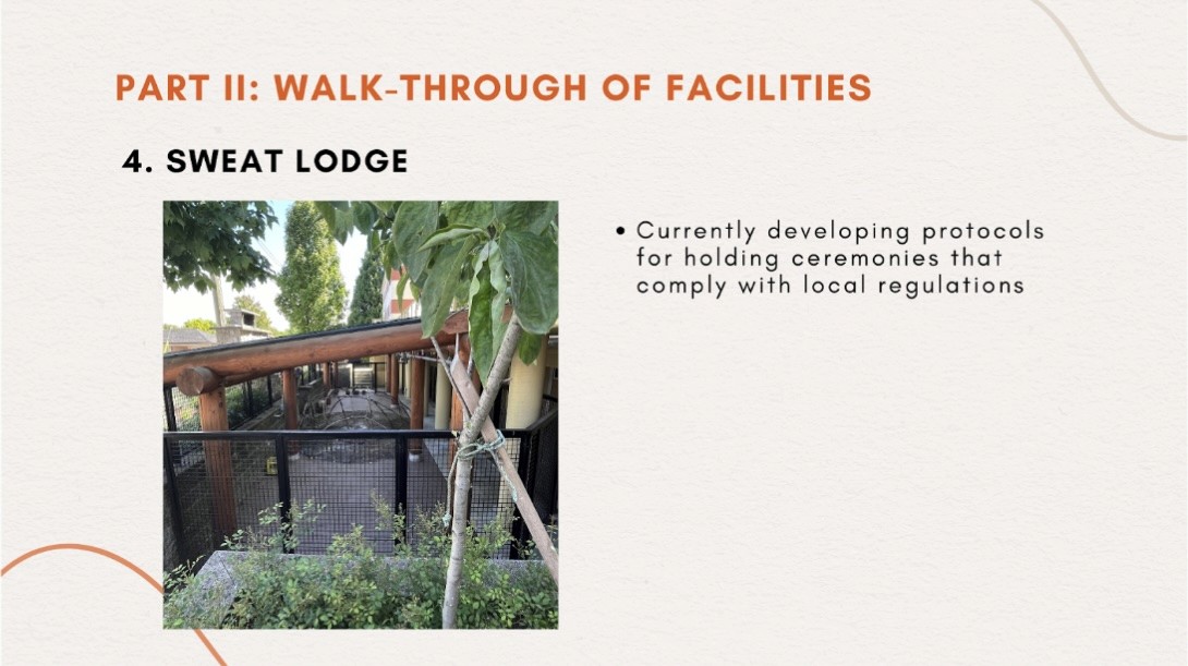
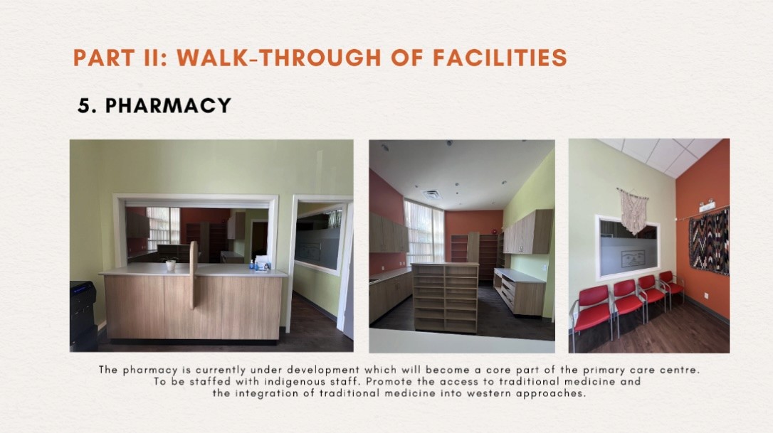
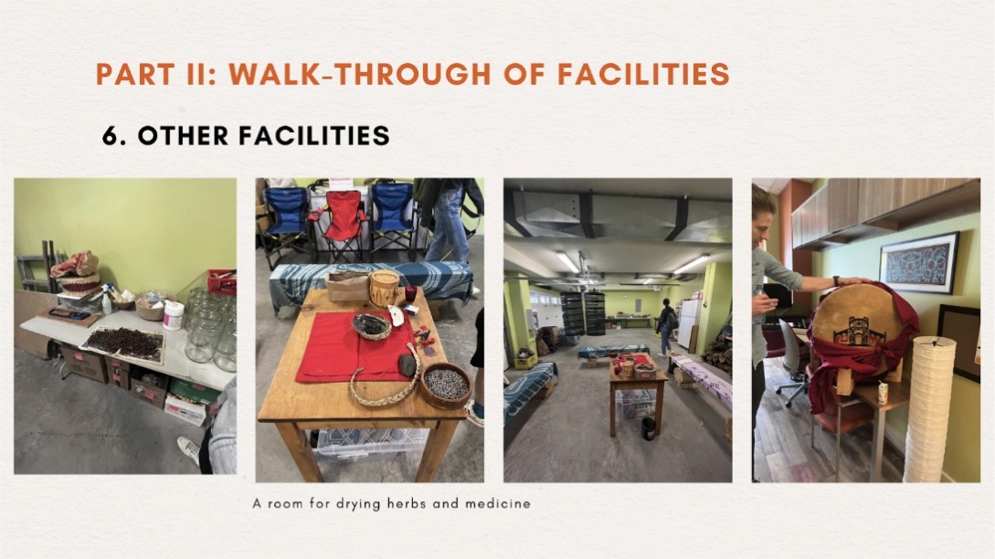
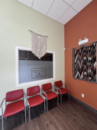
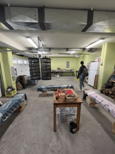
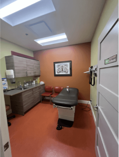
FNHA arranged a visit to the Lu’ma Medical Centre on, and the team had a better understanding of the general practices at FNPCCs and the facilities to be prioritized. Two staff members at Lu’ma Medical Centre, Dr. Michael Dumont, family physician and medical director and Larry Pecker, operations and wellness director led the visit and introduced the various facilities and the integration of Traditional medicine into western approaches at Lu’ma.
Observations from Lu'ma
Most importantly, after talking to the staff at Lu'ma Medical centre, we realized that the content that we are going to promote are already built by firs nation people what we need to do is mainly represent what is already there.
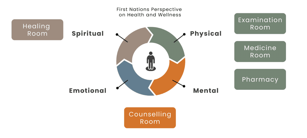
We decided to include healing room, counselling room, medicine room, examine room and pharmacy for the product for them delivering the primary care services as well as they set FNPCC different from general clinics in delivering culturally safe care.
Healing Room

Conselling Room
Medicine Room
Examine Room
Pharmacy

